Microsoft's Newest Theme - Office 2024
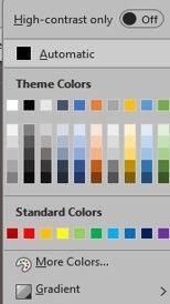
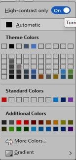
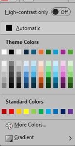
High Contrast Options:
Is it difficult to identify text in a document or details on a worksheet? Does your screen look so bright that it hurts your eyes and everything on it gets lost in the white background?
What are the best colour and contrast options?
What do you do on your computer? Do you write emails, just read emails, write documents, data entry, analyze data on spreadsheets? Do you attend online meetings, or search the web for information? How about photo editing, or project management? Are the tiny details important, do you need to readily identify shades of colours, or do you just want to make working on the computer more comfortable for your eyes?
Experimentation is key here. Not to worry though. If you make a change, it can readily be changed back. You should know though, some colour and contrast options affect everything on your screen while others only affect Microsoft 365 applications or only the one specific app you happen to be in. What does that mean for you? You need to check other applications once you’ve made a change to see how the changes you’ve made affect everything else. If you are a novice to intermediate user of computers – you should write down the steps you have taken to make the changes you have made, so it’s easy to reverse what you have set in place; should you decide you don’t like the changes.
What exactly is Colour Contrast?
Contrast refers to the ratio between bright and dark colours on your screen. Sufficient contrast means text and background have enough difference to be clearly seen. Essentially, it means you are following good design methodology. At it’s very essence colour contrast is how one colour stands out against another. Higher contrast makes it easier to make our distinct shapes on screen.
Normal Text Contrast Ratio: 4.5:1
Large Text Contrast Ratio: 3:1
Here’s the issue. Word uses RGB values for colour and most online colour contrast checkers use HEX values. If you stick to black and white, or navy and white there will be no need to check the contrast.
You can use a Google Colour Picker, to change from RGB to HEX, or
You can use an Online Colour Contrast Checker to find the contrast ratio.
High contrast is important for low vision users who may use a screen magnifier or invert screen colours for easier reading. Invert colours is available on a lot of devices and is usually referred to as “Night Mode” which features light text on a black or darker background.
High Contrast is used to improve text and image visibility in bright or low light environments ensuring reading and understanding content is as comfortable as possible for the reader. The result is minimizing eye strain and fatigue, by increasing the contrast between text and images with the focus on ensuring the content is understood.
Why Use the High Contrast Button Option?
High contrast mode offers several benefits, including:
- Improves visibility and readability: High contrast settings make text and elements stand out more clearly, enhancing readability for users.
- Reduces visual noise: By emphasizing essential content and minimizing distractions, high contrast reduces clutter and makes interfaces cleaner.
- Reduces eye strain: High contrast can ease eye fatigue, especially during prolonged screen use. The sharp contrast between foreground and background reduces the effort required to focus.
- Eases light sensitivity: For individuals sensitive to bright light, high contrast provides a more comfortable viewing experience by reducing glare.
- Improves focus: High contrast helps users quickly locate and focus on critical information, improving overall usability.
Remember that high contrast mode isn’t exclusively about increasing color contrast; it’s about optimizing the visual experience for different users’ needs.
If you would like to learn more - contact sales@westernts.ca or call or text to get more information.